
The Grand
Staircase
Boiler House
Void of boiler 3
Secondary Space
Re-imagining the purpose of a staircase by making the experience become an opportunity for a social journey through the verticality of the boiler house

Inspired by Escher art, the main stair case aims to become a grand sculpture/artwork that vertically connects all my spaces. Rather than having the one function of being a mode of vertical transportation, these stairs encourage places to meet, interact and view your surroundings - it gives opportunity to a range of '4th spaces'.
MATERIALITY
Hover over the circles to reveal information about the material seen in this space


COLOUR CHANGING
WALLS
MATERIAL:
Thermochromic paint (paint that changes colour when it heats - ie from the heat of your hand
SUPPLIER:
OliKrom
COLOUR:
Resting colour to be navy blue to then change to tan colour. NOTE: colour changing pigmented paint will only be used on the interior of the side of the stairs walls from the floor to when the surface hits the strip lighting in the handrail. Everywhere else will be non-colour changing navy blue paint
SUSTAINABILITY:
Although this product will be sourced from overseas, it is highly valuable in the engagement of my form and design strategy.

TACTILE
INDICATORS
MATERIAL:
Custom designed navy blue powder coated stainless steel tactile indicators
SUPPLIER:
Novaproducts (Australian owned business)
FORMAT:
Size as per Australian standards with custom printed design on top face
SUSTAINABILITY:
The use of this product is crucial in the safety of people using the stairs and is in accordance with Australian construction standards.

CONCEALED LED
LIGHTING
MATERIAL / COLOUR:
Concealed LED strip (5000K)
SUPPLIER:
LED eco lighting (family owned Australian business)
LOCATION:
Concealed in the handrail and in floor to wall junction detail
SUSTAINABILITY:
LED eco lighting’s LED are long-lasting, cost-effective and reduce electricity usage (thus reducing greenhouse gas emissions). Using LED also means less maintenance and waste in replacing light bulbs.

STAIR
NOSING
MATERIAL:
Aluminium stair nosing with tan powder coat
SUPPLIER:
Novaproducts (Australian owned business)
SUSTAINABILITY:
The use of stair nosing is crucial in compliance with Australian building standards and allows for my space to be a safe environment

COLOUR CHANGING FLOOR
MATERIAL:
Pigments with piezochromic paint (paint that temporarily changed colour from pressure)
SUPPLIER:
OliKrom
SUSTAINABILITY:
The use of stair nosing is crucial in compliance with Australian building standards and allows for my space to be a safe environment
COLOUR / FINISH:
Matt beige pigment to change to navy blue under pressure
Level of pressure to change: sensitive. Temporary colour change.
SUSTAINABILITY:
Although this product will be sourced from overseas, it is highly valuable in the engagement of my form and design strategy. However, the paint finish is highly durable and easy to clean and maintain.
Interior perspective of the stair case

OVERVIEW OF THE SPACE AS A WHOLE
The below animation shows my staircase as a whole / sculptural element. Specifically, it shows the intertwining of spiral and straight stair runs and forms that comes together to create an engaging visual experience from both an interior and exterior view.
INTERACTIVITY
An important design element of my staircase is to create opportunities to stop, explore and socialise. Specifically, this is done through the change of colours when you walk on / touch the interior of the space and through moments of rest such as 'the lookout' area. It is these design choices that take the mundane action of directly walking up a set of stairs and make it something experiential. Indeed, it is this rethinking of what the purpose of a staircase could become that I want to inspire the users in further ways of innovative thinking.


Animated detail perspective showing the interactivity of the colour changing paint
Interior perspective from the lookout platfrom
THE DETAILS
My approach to detailing this space came from a place of wanting to keep things seamless as to not distract from the artistic nature of the form on the large scale but still wanting to continue my theme of understanding the importance of acknowledging pre-colonial history on this site.

CUSTOM TACTILE INDICATORS
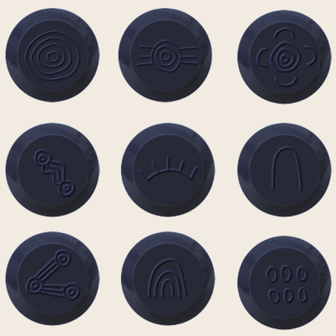
The custom design of my tactile indicators imprint indigenous symbols for people, community, journey and land
Sensory playground glass edge etching and electroluminescent tape detail
Detail perspective of stair nosing, step floor and wall junction and tactile indicators
THE SPACE OVERALL
When viewing my staircase from an overall perspective, I intend for its forms to become an art piece that visually and dynamically connects the large verticality of the space. Ultimately, I was inspired by the illusional feeling of M . C Escher's artworks of stairs in making design decisions to eliminate the conception of using these stairs for a direct path to another space.


